

At the beginning of 2015 I was pulled into the AdWords Next effort was starting to ramp up. AdWords Next was a built-from-scratch effort to create a new, Material Design AdWords instead of reskinning the old version.
For Overviews, I started as the lead designer for Video (one of the 4 branches of Google Ads stack), and I ended as the lead for both Video and Display when AdWords Next shipped.
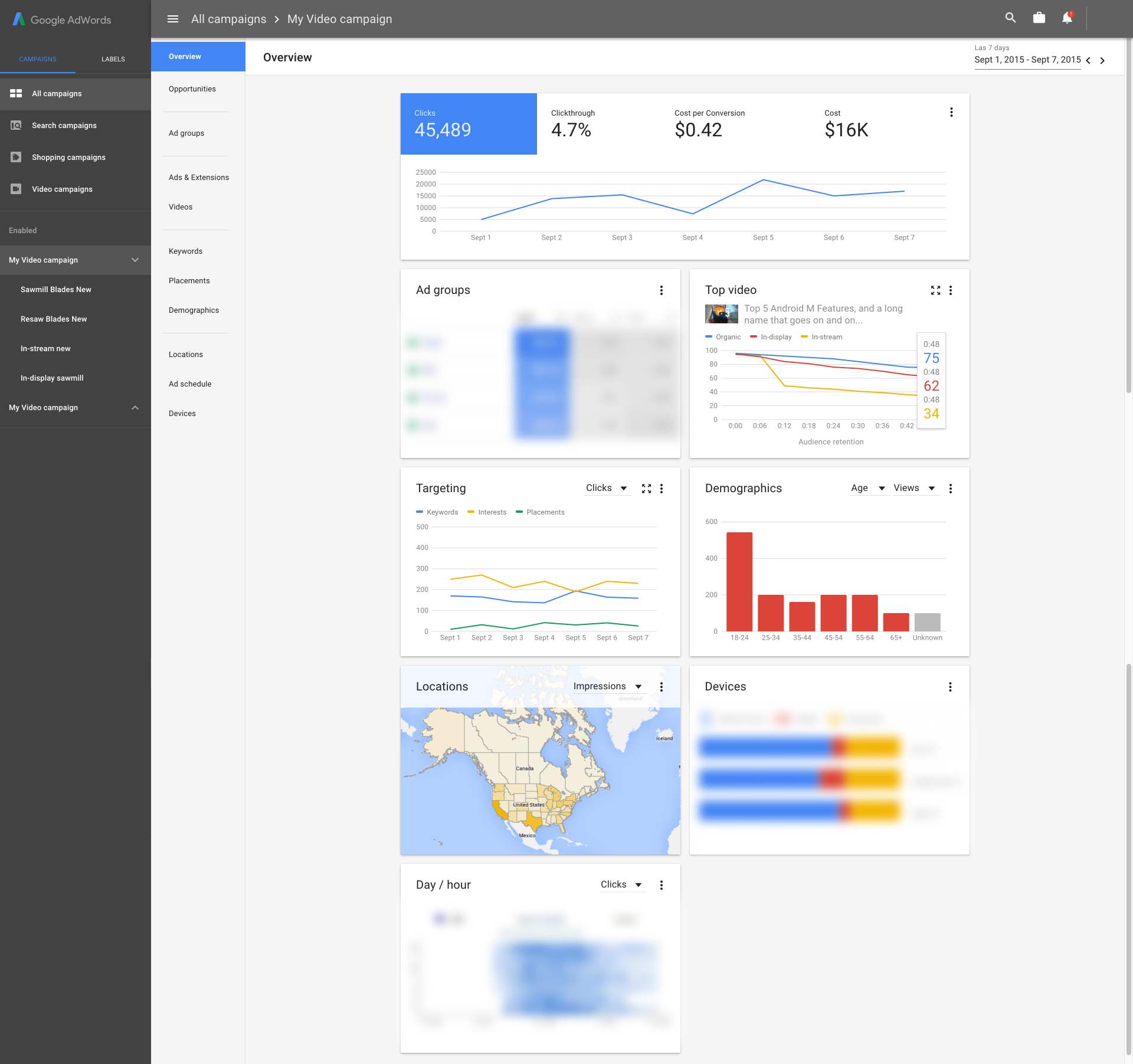
This project shipped at the point of AWV launch because it was the landing page of the new AdWords. Every user of AdWords, every time they open their account, see Overviews first.
Cross-functional work
From start to end, this project lasted 2.5 years. Getting this project to ship involved significant cross-org and cross-functional collaboration across, Design, Research, Engineering and Product Management teams across Video Ads, Display Ads and Search Ads organizations.
While this was going on, I was also working together with the Overviews design leads of the 3 other branches, with 3 other designers leading one each. Later in the process, I took over the Display Ads Overviews lead role as well.
-
PM: I had to work with product managers to pitch a major pattern I had proposed to ship in AdWords Next — the expandable cards.
- This required my PM and I to prepare for a few weeks to get to the ‘high court’ of AdWords directors and make our case. This required significant PM review because it did affect the product scoping, and extended what Overviews could provide.
-
Design: The 4 leads for each of the branches met every week to work through our common challenges and generalize patterns that we have found useful.
-
This required a long-term (multiple years) collaboration where we had to learn about each other’s branches and try to build patterns that work for all four of us.
-
In the end, we have managed to get most of our patterns in sync, with some exceptions made for unique product features that each of the branches offers. (Example: shopping is much more programmatic than others, so it requires design patterns to traverse large amounts of tree-style information.)
-
-
Research: Since AdWords Next was a blue sky effort, I had not only very significant support from the research team of my own Video Ads but also the research team of the greater AdWords.
-
They had collected a veritable number of historical research records about the pain points and issues the users face in AdWords, and this was our time to be able to fix most of them in one shot. Before starting to work on this, I spent the time going through the entire research archive we had looking for AdWords UI research.
-
My researcher and I worked in weekly cycles where I would present the new design proposals, get her first gut reaction based on her prior research, and then that would be incorporated in the next round of design proposals.
-
Later in the design process, I started to create prototypes that can be navigated by users, and we did user-test these. This has resulted in the learnings mentioned later in this study.
-
The problem(s)
Inconsistent insight surfacement. AdWords constantly looks at the incoming data and notices unexpected changes or points of easy improvement. However, the surfacing of these was haphazard, as every team in AdWords had their own way of showing the insights they generate, within the UI they control. Added to the fact that the insight quality was variable from team to team, we had inadvertently trained the entire AdWords user base to ignore all insights we had generated.
Running campaigns is too demanding of time. A very common complaint with the non-expert users was that AdWords was too complex, and even a basic trip to check the running campaigns and their metrics on an ongoing basis required intricate analysis of 5-6 different parts of AdWords. This took upwards of an hour if an active, reasonably complex campaign is present.
It is very difficult to summarize data. On the expert end of our user spectrum, a common complaint was that they were tasked with generating reports and then presenting them to their colleagues on a regular basis. For a lot of experts, this involved meticulously visiting all the relevant parts of AdWords and taking screenshots, again and again, every day. This was manual labour that was a very low return effort compared to time spent on it, yet AdWords offered no automated reporting, nor did it even have a way to customize the UI in a way that gets the necessary information in one place.
Solutions
a) Card based, dynamic tiling interfaces.
As the designer of the first card-based UI in AdWords (Non-material-design Video Analytics), before the Overviews product mentioned here, I was always a big proponent of card-based layouts. I had three reasons for this:
- Cards subdivide product into components, which can be imported into other products. Cards demarcate the content into meaningful blocks that indicate semantic boundaries. Unlike a non-card-based layout, this allows a card, which is a subcomponent of a product being designed, to be ‘imported’ into another product that did not yet exist at the point of its creation. This helps a lot with product sustainability, and in avoiding designing multiple interfaces for the same semantic block in the product again and again.
- Cards can be added or removed as needed without breaking the UI. This was the key insight that allowed Overviews to be a delivery endpoint for insights — we would add or remove cards based on whether we have a qualifying event to show the user. A card-based tiling UI allowed new sub-UIs to be added and removed. As crucially, it also allows the events being added into the UI to have their own UI work since they get a card within which they can show any design that best suits that insight.
- Card tiling creates columns, which is very mobile-compatible. While this was not a factor in the core AdWords app, which is a desktop web product, this was influential in allowing AdWords mobile apps to move forward with this design as parts of the mobile app does implement web views to show components that they did not have mobile-native UIs for. Using cards allows us to reduce the load of designers working on the mobile apps by enabling them to be able to directly import any card-based AdWords subproduct as is as a web view within the app.
This was a big improvement compared to the older, decentralised insight-delivery UIs in other products we had because those mostly acted as notifications which are largely a line of text. In Overviews, our insights became first-class residents that were capable of showing their own UI and charts.
As the lead designer of the first product that shipped with cards, I was the originator of the cards-based UI in AdWords. However, cards being used in Overviews was a result of my cards work organically spreading to the rest of AdWords as a useful design pattern, and not a top-down design decision.
As a result of this, when the Overviews product started its design process, I did not need to convince anybody about using cards; it was already the consensus.
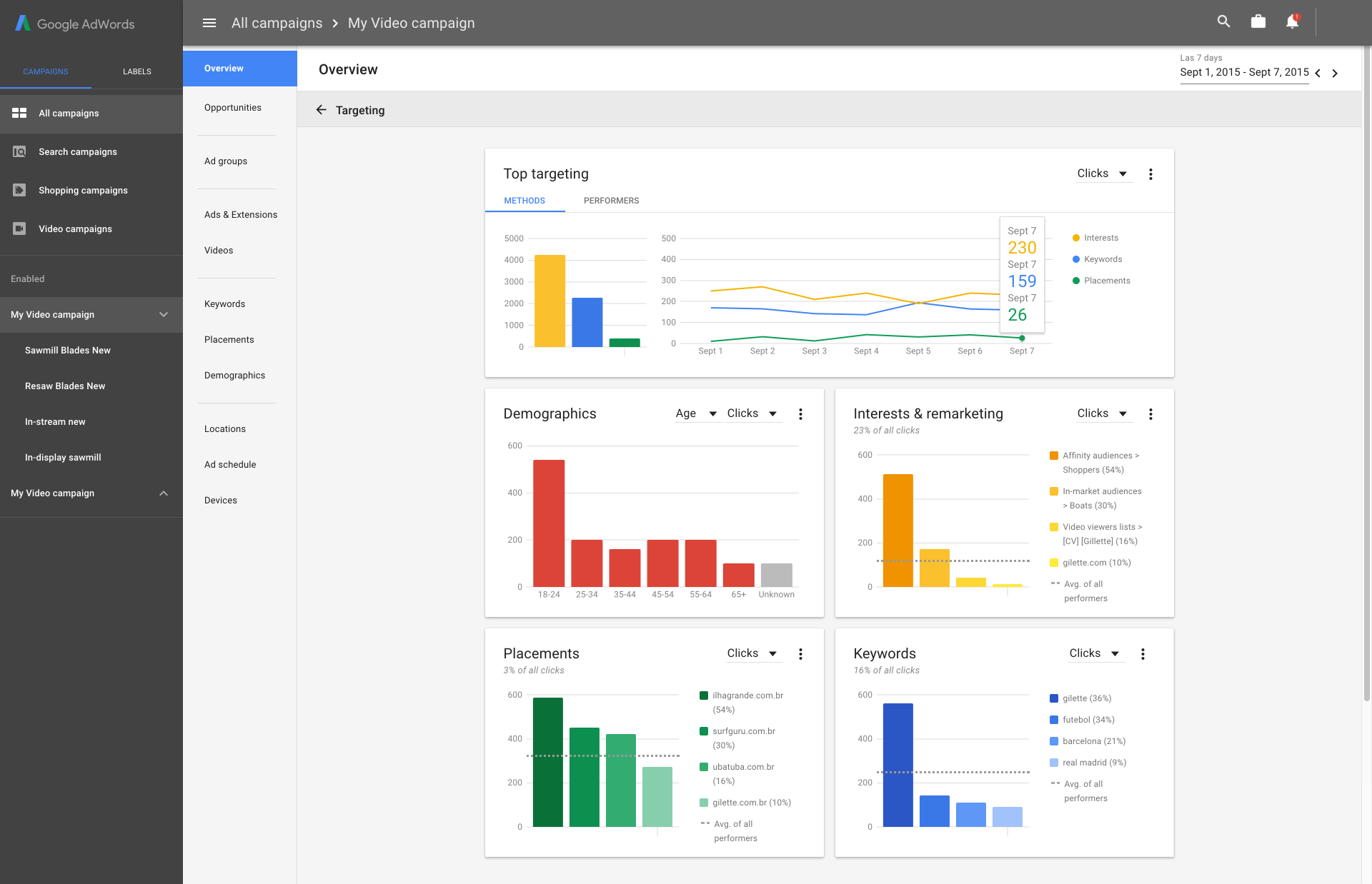
b) Insights as cards alongside core metrics cards
One of the core problems Overviews attempted to solve was every sub-team of Video Ads and other teams having their own insight surfacing. This looked like every location in AdWords had its own notification bell, and it was always red, pleading you to check it out.
Historical context
This issue had its roots in how AdWords teams tried to make their case for more headcount and increased influence. Fundamentally, the more users interact with, and the more they stay within, say, Targeting, the easier it gets to make an argument that the Targeting team is more instrumental in revenue accretion. In the real world, this has the unexpected side effect of making every team aim for maximum engagement even if that makes not necessarily a difference in revenue. This is a phenomenon known as Goodhart’s Law.
Since notifications and ‘insights’ are one of the bigger enablers of more time spent, a significant number of teams across AdWords started to build their own insights platform, which is good, and their own, custom-made location to brandish these insights — not so great for the whole of AdWords.
This also resulted in the insights raised being of variable quality, since the number of ‘notifications’ is a much bigger predictor of increased time spent by the user than their quality, or even, in the short term, than their usefulness to the user.
Right before the AdWords Next effort started, AdWords had nixed the per-subproduct notification centres and created an AdWords-wide one. However, that notification centre was far too hidden, which made a large majority of users be not aware of its existence. It was also full of notifications that are separated from their contexts and did not always make much sense, especially when coupled with the variable quality of insights provided by the teams.
Overviews was the second attempt at getting this right. The two main problems with the original notifications location were these:
- The insights location itself was too hidden.
- Notifications raised there did not have enough context to make sense when separated from their original, in-context locations.
Since Overviews were the landing page of AdWords next, it made sense to make it also the primary surface for insights. Since it was also based on a flexible card UI, we had a significant capability to bring the missing insight context.
Combining these two, Overviews' core behaviour ended up as:
- Core cards raise insights within them as an overlay state to provide context. This allowed us to show events such as seeing an unexplained traffic spike or dip in a timespan that is not a known space/time for such an event (such as Christmas in countries where it is celebrated, different in others) on top of the actual, primary graph tracking that metric (e.g. views). Since the context for this type of notification is the graph that the card carries already, a dismissable notification state is better than replicating the same graph in a different card.
- Non-core or complex insights raise their own cards and add them to the stack. In this case, if an insight is complex enough, or it carries actions that can be taken in one click, a card that is exclusively for that notification is raised. This card is primarily a solution to the insight context issue, especially for insights coming from non-primary components of AdWords.
c) The ability to expand cards
After the video team started to run research rounds on the initial Overviews design, we received several pieces of crucial feedback from the users. One of them was that, while cards did provide a quick way to see what’s going on within a campaign, they were not entirely enough, and they did not remove the need to visit the actual page, even for a quick daily check.
This was an interesting place to be, because:
On one hand, we did not want to reinvent the actual location in the card. The card design was purposefully simpler and less comprehensive, and we wanted to keep that to retain our gains in terms of comprehensibility for non-expert users.
On the other hand, if our design was simple but not at least reasonably comprehensive, we ended up with the risk of users entirely skipping the page and obviating the benefits we were working for.
This was one of the times the 4 AdWords branches went their own way based on their team’s needs:
-
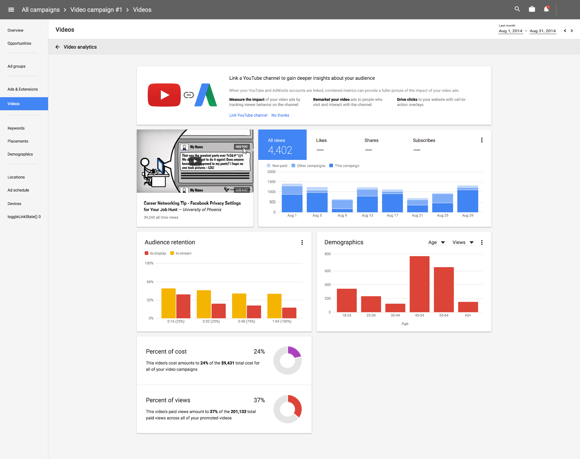
I, as the design lead for Overviews for Video ads, ended up choosing a card-expansion pattern. This worked for us because since we were the earliest user of cards pattern in AdWords, the locations we owned that were video-specific (such as Video Analytics) were already card-based. As a result, expanding an Overviews card to reveal a ‘hovering’ interface that is also composed of cards made sense. Our early bet on cards and their portability helped here.
-
Search ads ended up choosing to make their cards to have the ability to change what ‘tabs’ the card has at the top. This allowed the user to choose which tabs the card would show, with the core single-number metric as the tab’s ‘Name’, and a chart enhanced with insights as the content of the tab. In case of not being able to import card-based content easily, their design made the most use of their significant number of legacy locations.
Display ads and Shopping did not have enough types of cards to need expansion or configurable card tabs.
d) Ensuring a stable, recognizable layout in Overviews even when it changes based on insights over time
This was the other major result of the user research after our first draft design. The user feedback about the Overviews card layout was that we had overshot on being ‘smart’, and it was difficult to ‘learn’ the Overviews UI as it was constantly being modified by insights landing on it every day — a card that was an insight could be there one day and not in another once it expired.
This we solved via two paths:
-
The Overviews was made such that the layout remained much more stable over time, by ensuring that the ‘core cards’ (Such as the main Metrics Report card, Targeting, Ad Groups) remained fixed and always present in the same location. This allowed the users to be able to learn and recognise the page, as the top few cards were always the same.
-
The greater AdWords PM team started another project based on Overviews which allowed the users to create completely custom dashboards. The primary features it had were being able to determine the size of cards, pinning them to a grid and the ability to pin any card into this dashboard. This work borrowed most of its design from Overviews and used it as a base platform, but it allowed us to propose features that were aimed towards the expert end of our user spectrum.
As a result, in Overviews, we ended up splitting the ‘difficulty of summarization’ issue into two — Overviews focusing on the summarization of data for non-expert users with our stack of automated cards, and Bento focusing on the expert end, with completely manual card handling.
On my end, I proposed the ‘card pinning’ feature, and also, having a visual distinction between insight cards and the core cards after launch.
Duration
Early 2015 → Mid 2017
Team size
- Apprx. 10 engineers touching Overviews, from 50+ working on AdWords Next
- 4 PMs, 1 PM manager (2 of which is direct collaboration) on Overviews, otherwise all PMs on AdWords when their product touches Overviews to create a card
- 4 designers, one leading each, Video (which I led), Display (which I led at impl. stages), Search and Shopping
Role
- Design lead for Video Ads Overviews
- Design lead for Display Ads Overviews
Design Work
- Product design
- Prototyping