


This is a collection of non-product design work I’ve done over the years. Some of these were client work, some were briefs based on curricula, and some others are entirely self-directed.
Eksiyirmidört
Role Publication designer
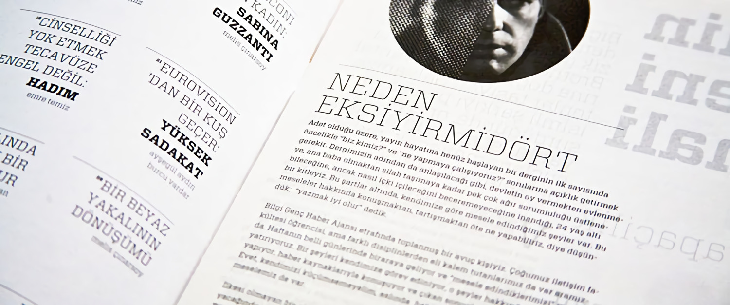
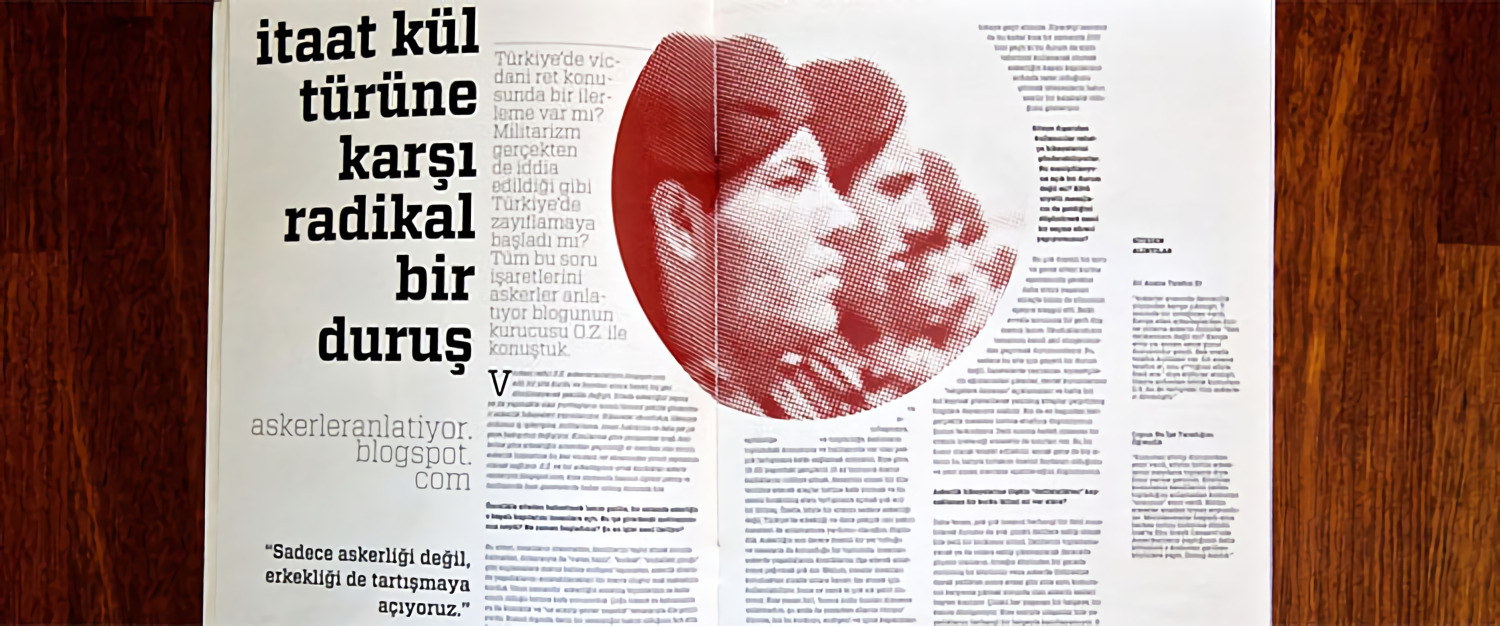
Eksiyirmidört was a left-wing magazine in Turkey that I was the design lead of. Some part of the design work was informed and inspired by the significant monetary constraints we had — for example, we did not have enough money for the full-colour CYMK print, so instead, I picked only red and black, which cut our monthly printing press bill in half.
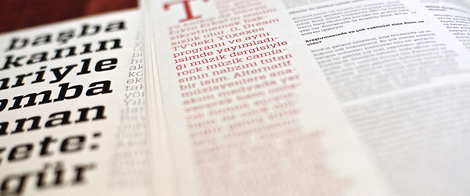
We had to use the halftone effect for all images printed in any colour other than black. This was because any other attempt to print non-black-white images would end up dark red mud due to the missing Cyan, Magenta and Yellow plates in the printing press we could not afford.
The design for Eksiyirmidört won second place in the Doğan Media Holdings Young Communicators Award for 2011, a national, non-profit design industry body, recognising the best of design in Turkey, primarily funded by Doğan Holdings' philanthropic arm.
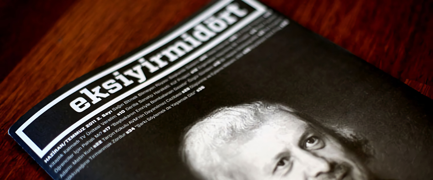
Eksiyirmidört in Turkish means minus 24, that is, younger than 24, which all of us were. This was also the last project I led in Istanbul before I left for the United States in 2011.
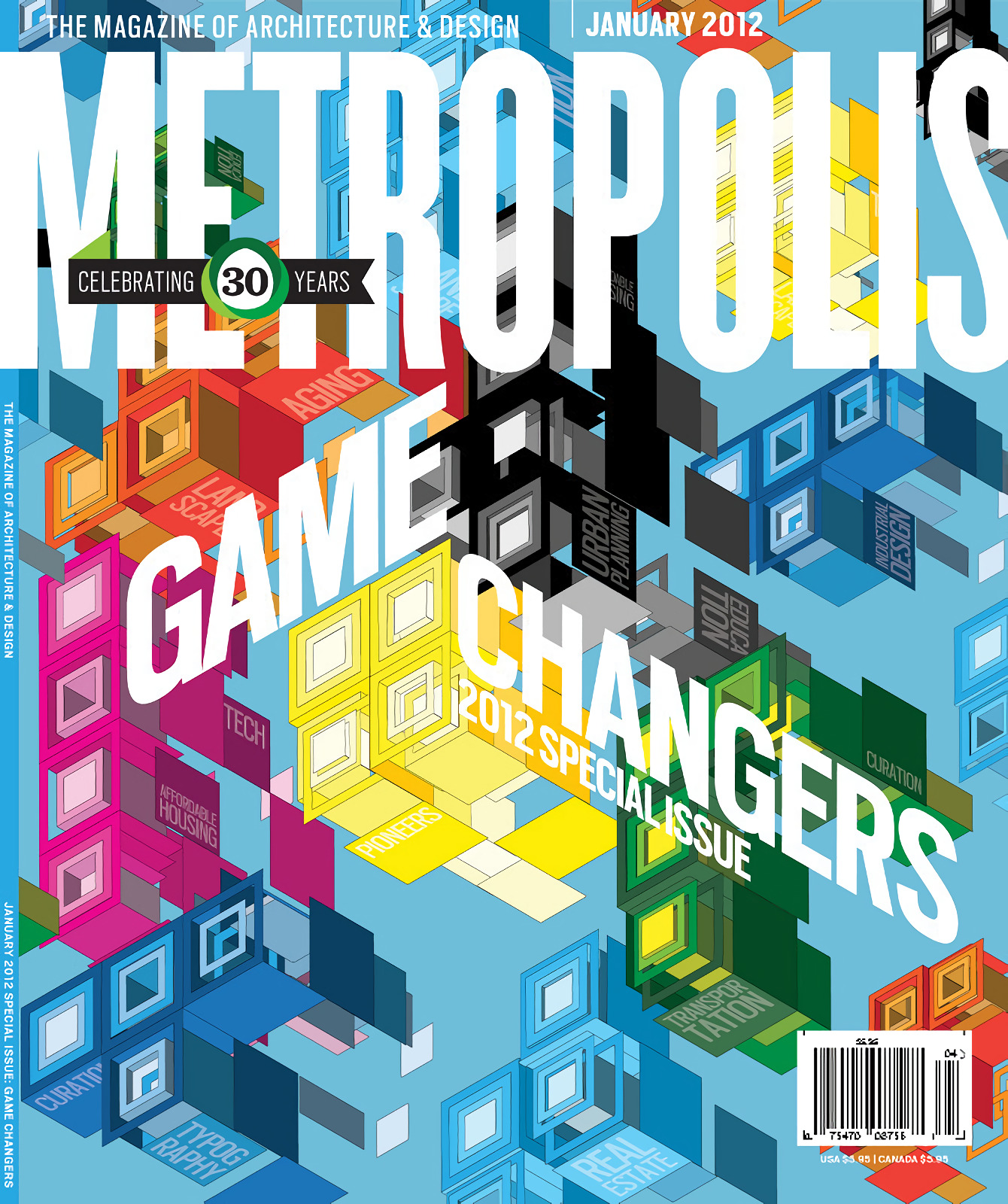
Metropolis
My design school in New York, Parsons the New School for Design, had a competition where we would be designing for the 30th-year-anniversary of the Metropolis, a magazine about future tech, industrial design and sustainable architecture.
My cover, one of the few selected, was about it all coming together like pieces of a game of Tetris, and that it was our job to make it all sit right and work — the pieces being there on their own did not necessarily solve much unless they are in the right place. With the pieces still in the air, it remains to be seen how they’re going to land, and how impactful they will be.
Posters
These are several of my favourites from the visual design work I’ve done in the past. This is, without doubt, a different, more vibrant kind of design than metrics-oriented product design, and it arguably stands the test of time better than most user interfaces.
Istanbul 1910-2010
Role Exhibition designer
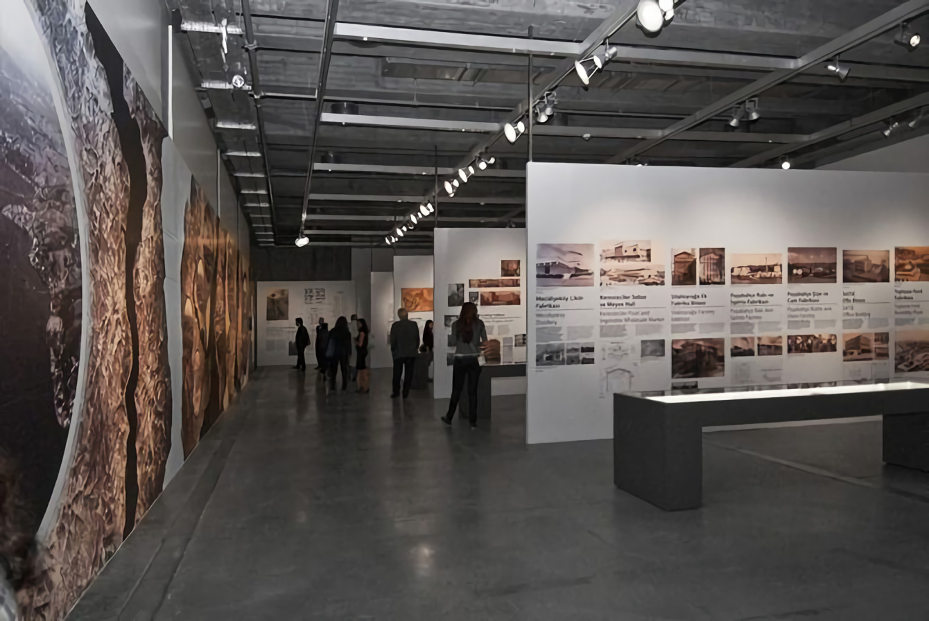
Istanbul 1910-2010 was an exhibition in Santralistanbul the modern art museum located in Istanbul Bilgi University’s Silahtarağa campus as part of the Istanbul’s 2010 European Capital of Culture series of events, organised and funded in part by the European Union and in part by Government of Turkey.
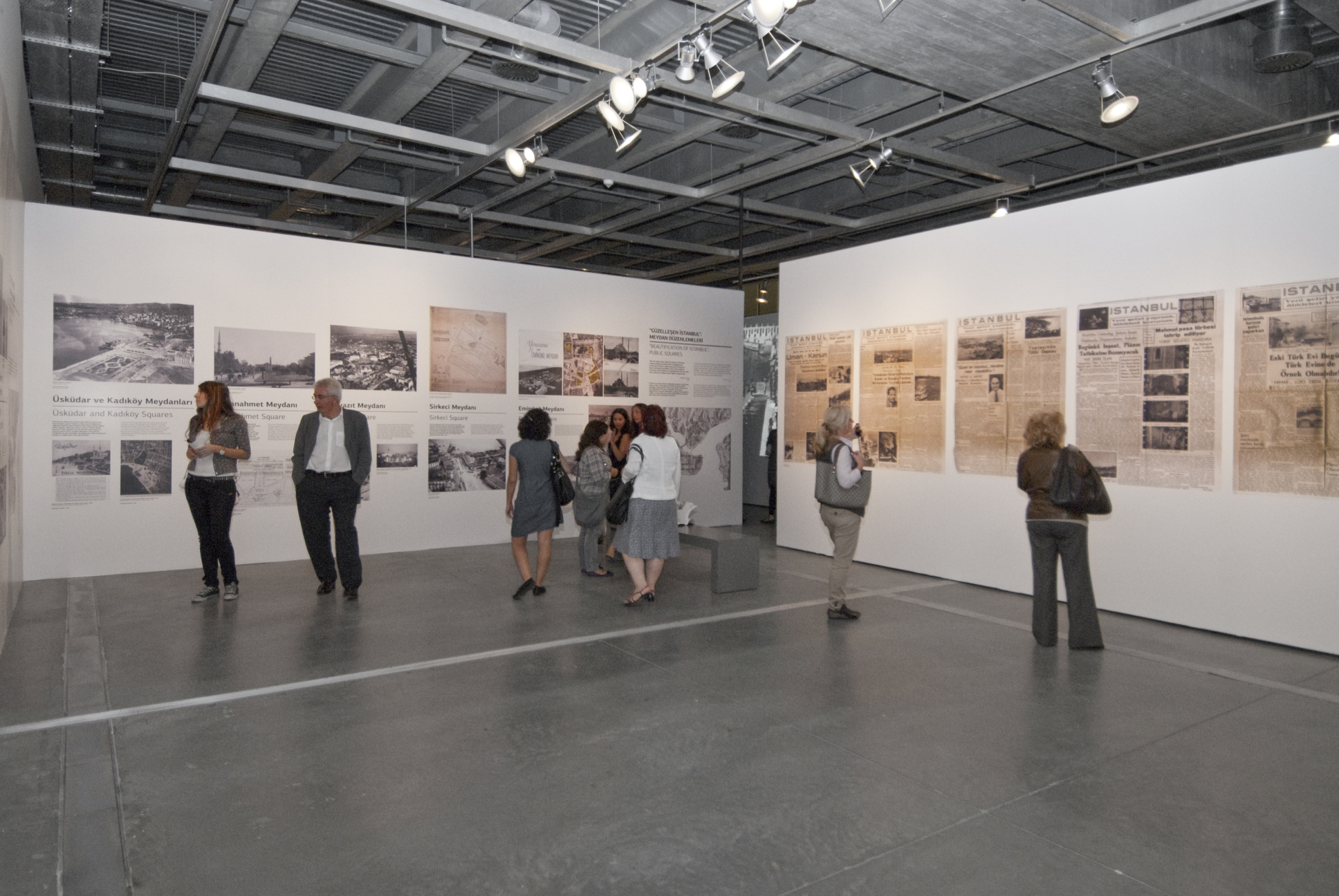
I was the designer for the large-scale graphics the largest of which covered 15 meters of an uninterrupted wall, and 3 meters high. I also designed some of the detail panels, shown above.
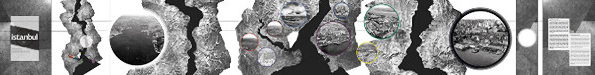
The primary headliner carried a 1944 map of Istanbul, on which I had overlaid historical aerial surveys taken through the last century. The primary map on the left carried the coloured outlines of various sizes where the colours correspond to the contour colours of the images on the right, and the sizes of the circles mapped to the view area of that particular photo.
For example, the biggest white dot is visible on the leftmost map, and immediately to the right of it is the circle with the white outline, providing an aerial survey covering the blotted zone.
The photos on the right correspond to the rough locations on the right-side maps, as well.
On the rightmost end, the blank white circle was a mounting location for an interactive display that allowed users to zoom into the map and the images.
Date
2009 - 2014
Design Work
- Visual design
- Publication design
- Exhibition design